Fill-out Forms and Input fields
[Top] [Up] [Next] [Previous]
10 - Fill-out Forms and Input fields
Forms are composed by placing input fields within paragraphs, preformatted/literal text, lists and tables. This gives considerable scope in designing the layout of forms. Each field is defined by an INPUT element and must have an NAME attribute which uniquely names the field in the document. Additional optional attributes can be used to specify the type of the field (defaults to free text), its size/precision, its initial value and whether the field is currently disabled or in error:
<FORM ACTION="mailto:www_admin@info.cern.ch">
<MH HIDDEN>Subject: WWW Questionaire</MH>
Please help up to improve the World Wide Web by filling in the
following questionaire:
<P>Your organization? <INPUT NAME="org" SIZE="48">
<P>Commercial? <INPUT NAME="commerce" TYPE=checkbox>
How many users? <INPUT NAME="users" TYPE=int>
<P>Which browsers do you use?
<UL>
<LI>X Mosaic <INPUT NAME="browsers" TYPE=checkbox VALUE="xmosaic">
<LI>Cello <INPUT NAME="browsers" TYPE=checkbox VALUE="cello">
<LI>Others <TEXTAREA NAME="others" COLS=48 ROWS=4></TEXTAREA>
</UL>
A contact point for your site: <INPUT NAME="contact" SIZE="42">
<P>Many thanks on behalf of the WWW central support team.
<P ALIGN=CENTER><INPUT TYPE=submit> <INPUT TYPE=reset>
</FORM>
This fictitious example is a questionnaire that will be emailed to www_admin@info.cern.ch. The FORM element is used to delimit the form. There can be several forms in a single document, but the FORM element can't be nested. The ACTION attribute specifies a URL that designates an HTTP server or an email address. If missing, the URL for the document itself will be assumed. The effect of the action can be modified by including a method prefix, e.g. ACTION="POST http://....". This prefix is used to select the HTTP method when sending the form's contents to an HTTP server. Would it be cleaner to use a separate attribute, e.g. METHOD?
Servers can disable forms by sending an appropriate header or by an attribute on the optional HTMLPLUS element at the very start of the document, e.g. <htmlplus forms=off>.
The MH element can be used to specify RFC 822 mail headers that are included when sending the form's content either as an email message or as a HTTP request, e.g.
<MH HIDDEN>
Subject: WWW Questionnaire
Priority: Low
</MH>
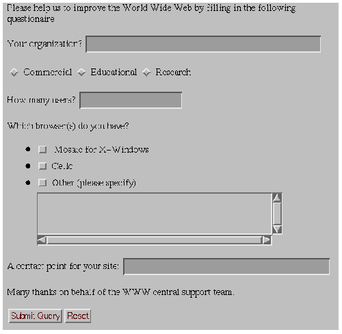
The MH element can contain several headers separated by line breaks. The text within the MH element is transcribed directly*1, preserving spaces, tabs and line breaks, with each line terminated by a CR LF pair as per the RFC 822 guidelines. The preceding example of a form might be rendered as:

Here, the <P> and <UL> elements have been used to lay out the text (and input fields. The browser has changed the background color within the FORM element to distinguish the form from other parts of the document. The browser is responsible for handling the input focus, i.e. which field will currently get keyboard input.
For many platforms there will be existing conventions for forms, e.g. tab and shift-tab keys to move the keyboard focus forwards and backwards between fields, while an Enter key submits the form. In the example, the Submit and Reset buttons are specified explicitly with special purpose fields. The Submit button is used to email the form or send its contents to the server as specified by the ACTION attribute, while the Reset button resets the fields to their initial values. When the form consists of a single text field, it may be appropriate to leave such buttons out and rely on the Enter key.
The INPUT element has the following attributes:
- NAME
- Symbolic name used when transferring the form's contents. This attribute is always needed and should uniquely identify this field.
- TYPE
- Defines the type of data the field accepts. Defaults to free text.
- SIZE
- Specifies the size or precision of the field according to its type.
- MAXLENGTH
- The maximum number of characters that will be accepted as input. This can be greater that specified by SIZE, in which case the field will scroll appropriately. The default is unlimited.
- VALUE
- The initial value for the field, or the value when checked for checkboxes and radio buttons. This attribute is required for radio buttons.
- CHECKED
- When present indicates that a checkbox or radio button is selected.
- DISABLED
- When present indicates that this field is temporarily disabled. Browsers should show this by "greying it" out in some manner.
- ERROR
- When present indicates that the field's initial value is in error in some way, e.g. because it is inconsistent with the values of other fields. Servers should include an explanatory error message with the form's text.
- SRC
- A URL or URN specifying an image - for use only with TYPE=IMAGEMAP.
- ALIGN
- Vertical alignment of the image - for use only with TYPE=IMAGEMAP.
The following types of fields can be defined with the TYPE attribute (upper or lower case):
- TEXT
- Single line text entry fields. Use the SIZE attribute to specify the visible width in characters, e.g. SIZE="24" for a 24 character field. The MAX attribute can be used to specify an upper limit to the number of characters that can be entered into a text field, e.g. MAX=72. Use the TEXTAREA element for text fields which can accept multiple lines (see below).
- INT
- For entering integer numbers, the maximum number of digits can be specified with the SIZE attribute (excluding the sign character), e.g. size=3 for a three digit number.
- FLOAT
- For fields which can accept floating point numbers.
- DATE
- Fields which can accept a recognized date format.
- URL
- For fields which expect document references as URLs or URNs.
- CHECKBOX
- Used for simple Boolean attributes, or for attributes which can take multiple values at the same time. The latter is represented by a number of checkbox fields each of which has the same NAME.
- RADIO
- For attributes which can take a single value from a set of alternatives. Each radio button field in the group should be given the same NAME.
- RANGE
- This allows you to specify an integer range with the MIN and MAX attributes, e.g. MIN=1 MAX=100. Users can select any value in this range.
- IMAGE
- This allows you to specify an image field upon which you can click with a pointing device. The SRC and ALIGN attributes are exactly the same as for the IMG and IMAGE elements. The symbolic names for the x and y coordinates of the click event are specified with name.x and name.y for the name given with the NAME attribute. The VALUE attribute is ignored.
- SCRIBBLE
- A field upon which you can write with a pen or mouse. The size of the field in millimeters is given as SIZE=width,height. The units are absolute as they relate to the dimensions of the human hand, rather than pixels of varying resolution. The scribble may involve time and pressure data in addition to the basic ink data. You can use scribble for signatures or sketches. The field can be initialised by setting the SRC attribute to a URL which contains the ink*2. The VALUE attribute is ignored.
AUDIO
This provides a way of entering spoken messages into a form. Browsers might show an icon which when clicked pops-up a set of tape controls that you can use to record and replay messages. The initial message can be set by specifying a URL with the SRC attribute. The VALUE attribute is ignored.
SUBMIT
This is a button that when pressed submits the form. It offers authors control over the location of this button. You can use an image as a submit button by specifying a URL with the SRC attribute.
RESET
This is a button that when pressed resets the form's fields to their initial values as specified by the VALUE attribute. You can use an image as a reeset button by specifying a URL with the SRC attribute.
When you need to let users enter more than one line of text, you should use the TEXTAREA element, e.g.
<TEXTAREA NAME="address" ROWS=64 COLS=6>
Hewlett Packard Laboratories
1501 Page Mill Road
Palo Alto, California 94304-1126
</TEXTAREA>
The text up to the end tag is used to initialize the field's value. This end tag is always required even if the field is initially blank. The ROWS and COLS attributes determine the visible dimension of the field in characters. Browsers are recommended to allow text to grow beyond these limits by scrolling as needed. In the initial design for forms, multi-line text fields were supported by the INPUT element with TYPE=TEXT. Unfortunately, this causes problems for fields with long text values as SGML limits the length of attribute literals. The HTML+ DTD allows for up to 1024 characters (the SGML default is only 240 characters!).
The RADIO and CHECKBOX fields can be used to specify multiple choice forms in which every alternative is visible as part of the form. An alternative is to use the SELECT element which is generally rendered in a more compact fashion as a pull down combo list. Every alternative is represented by the OPTION element, e.g.
<SELECT NAME="flavor">
<OPTION>Vanilla
<OPTION>Strawberry
<OPTION>Rum and Raisin
<OPTION>Peach and Orange
</SELECT>
The SEVERAL attribute is needed when users are allowed to make several selections, e.g. <SELECT SEVERAL>. The ERROR attribute can be used to indicate that the initial selection is in error in some way, e.g. because it is inconsistent with the values of other fields.
The OPTION element can take the following attributes:
- SELECTED
- Indicates that this option is initially selected.
- DISABLED
- When present indicates that this option is temporarily disabled. Browsers should show this by "greying it" out in some manner.
HTML+ Discussion Document - November 8, 1993
[Top] [Up] [Next] [Previous]

